
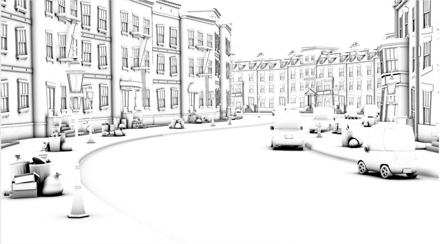
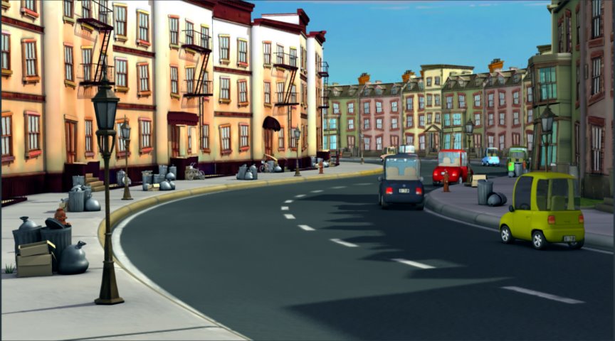

Thanks to you who posted comments on my last update. That test image was actually facing the wrong direction (if the characters were on the screen we would have seen only their backs) so that's what caused some of the lighting abnormalities. These new images should be lit properly. We consciously made the decision to have one side of the street in shadow and the other side brightly lit. It's not a theme of the film, but one of the concepts that we built into the subtext was that the kids from the "poor" side of the street are the ones with the imagination and the kid from the "rich" side of the street didnt need to use his imagination because he has always had whatever he wants. This is underscored in the dim lighting as well as the desaturated (less vibrant) colors of the rich side. But like I said, it's not a theme, so it's supposed to be subtle and just build contrast within the scene. Here I've posted the latest renders. You'll see just the beauty pass (diffuse, shadow, specular combined), the occlusion pass (soft shadows) and a test composite with the occlusion added to the beauty pass. I also added a subtle bump map to the street and DingDing finished the dirt maps. We havent broken the environment down into separate layers yet so we can tweak things individually (add depth of field, darken things as they recede, correct colors, etc.), but Chris did a final composite of the girl with her bears so that should give you an idea of the direction we're heading.

1 comment:
THE POOR SIDE IS VERY WASHED OUT ..LIKED THE OLDER ONE OF THE POOR SIDE BETTER...
RICH MAYBE PINK IS TO MUCH
AD TIRE MARKS ON STREET AND SOME OIL STAINS
Post a Comment